Design Case Study
Complete Nutrition is a leading supplement company with over a dozen unique in-house brands. With a consumer base ranging from the most extreme athlete to the mere health conscious, a clever strategy was needed to work flexibly across all sub-brands. As Creative Director, I re-envisioned their corporate identity as well as redesigned their eCommerce experience utilizing this new identity, a simpler CMS, & a more intelligent architecture.
Client: Complete Nutrition
Year: 2019
Categories: Branding & Identity, Interaction Design, Visual Design, Information Architecture
THE MARK
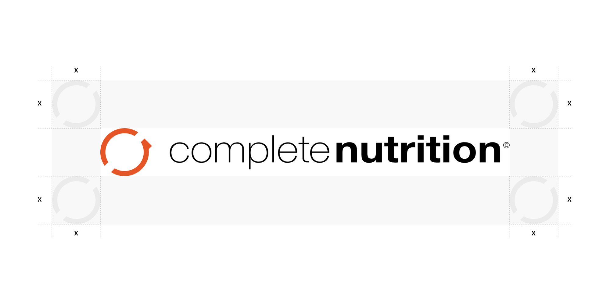
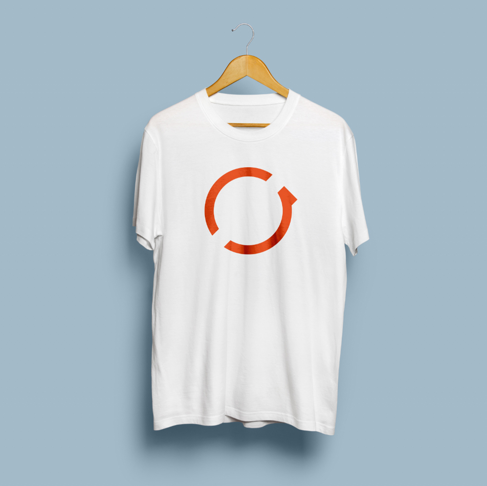
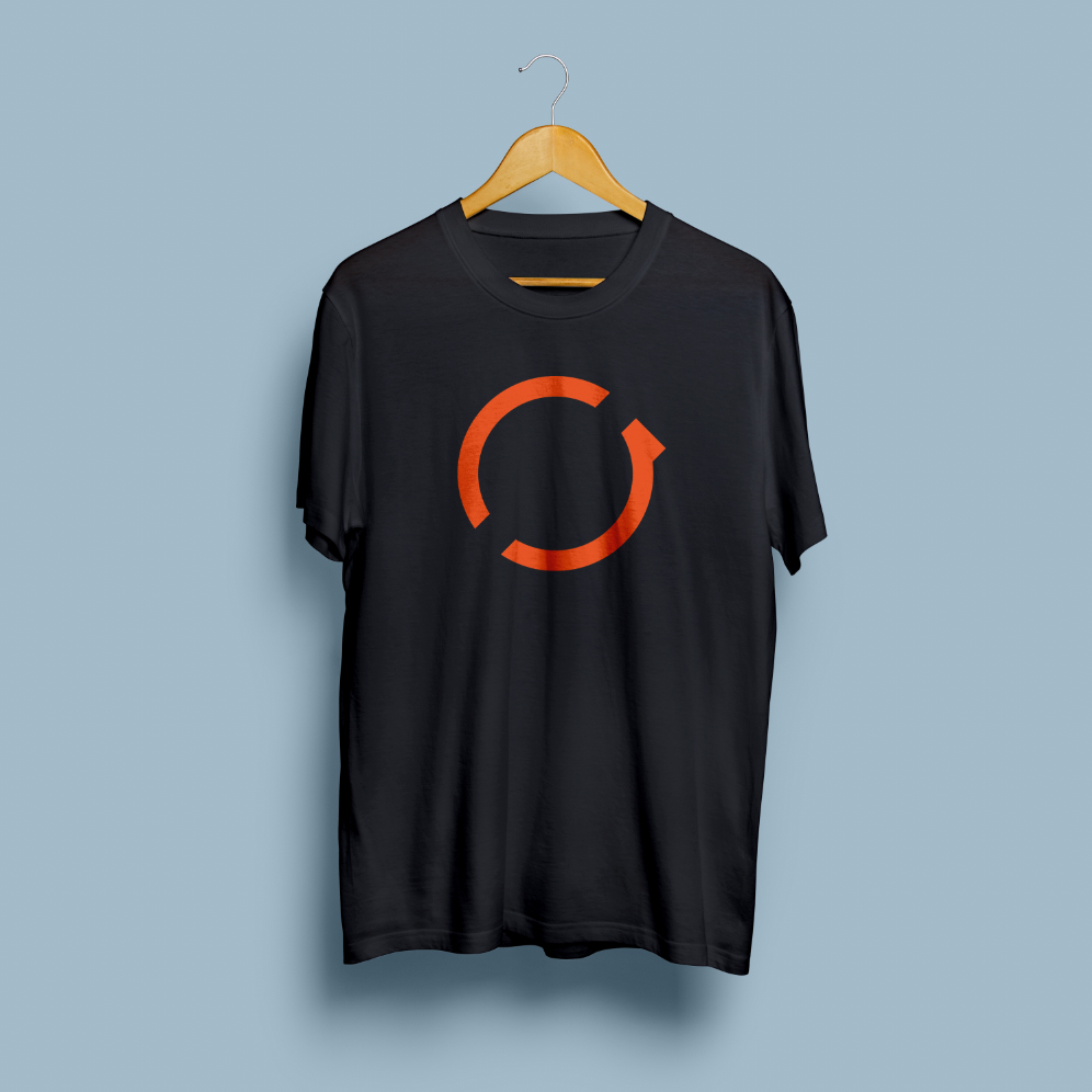
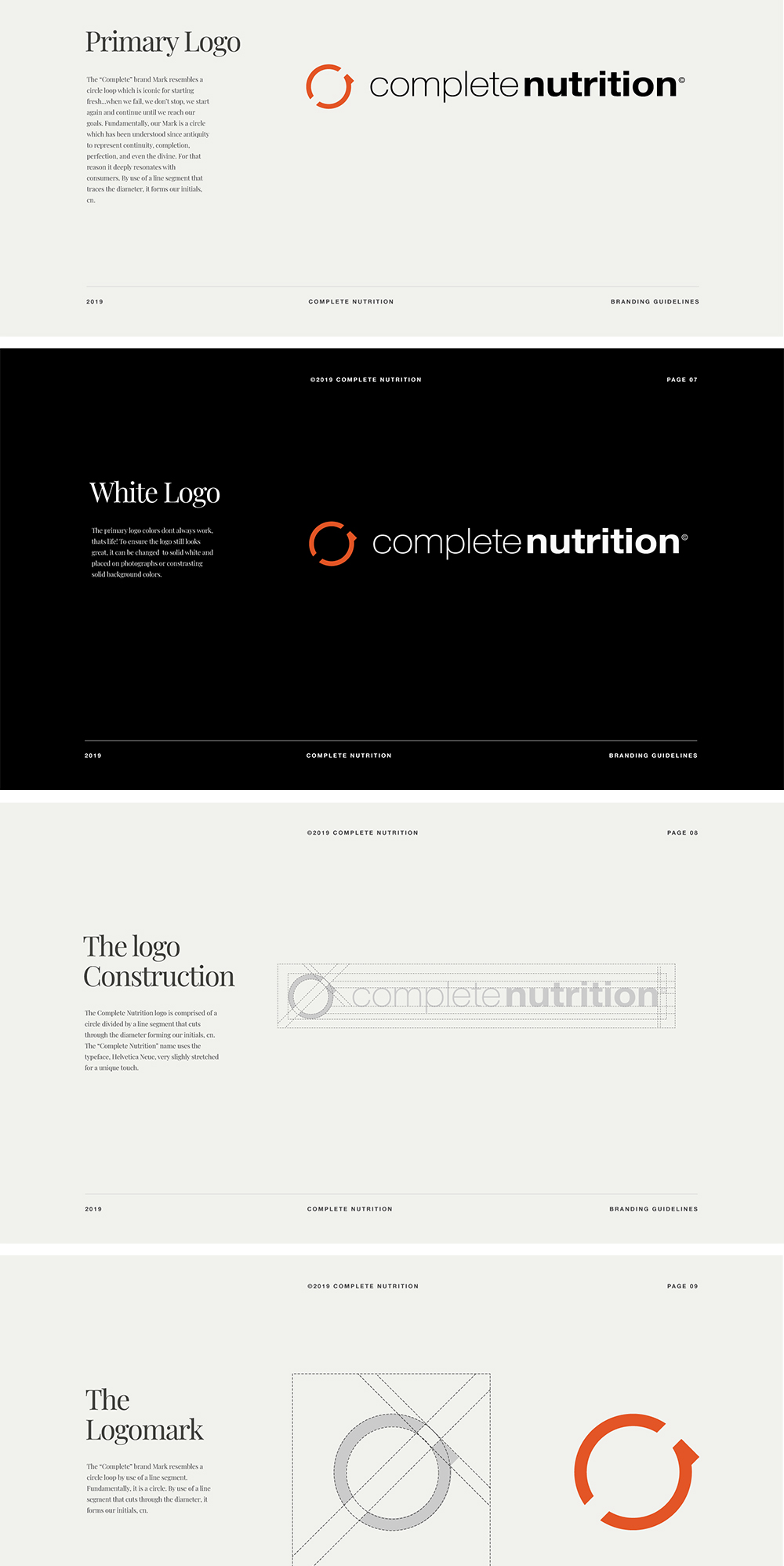
Complete nutrition is not just a name, its a value; a prerequisite to good health. With that in mind, the complete nutrition mark needed to simple and iconic. Its composed of a circle divided by a line segment that forms their initials; a tilted “C” and upside down “N”.



THE BRAND
Complete nutrition is for everyone, not just for some.

BRANDING GUIDELINES
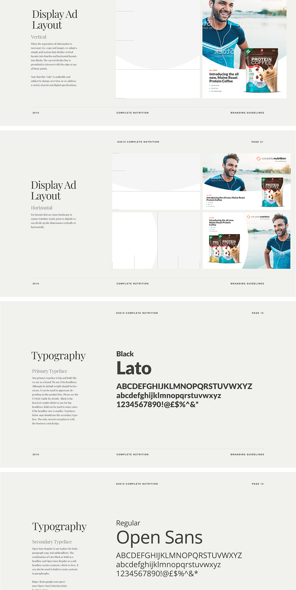
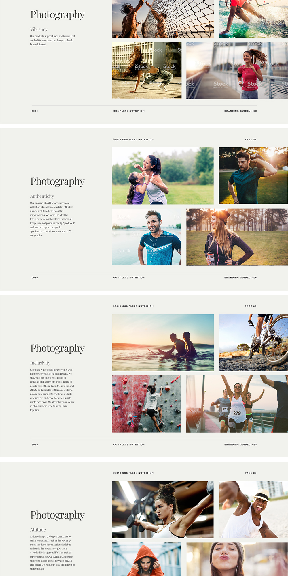
I created comprehensive branding guidelines to ensure that the way Complete Nutrition looks, feels, and sounds is as premium and consistent as their mission, values, and supplements. Here are a few slides from that document.
INFORMATION DESIGN
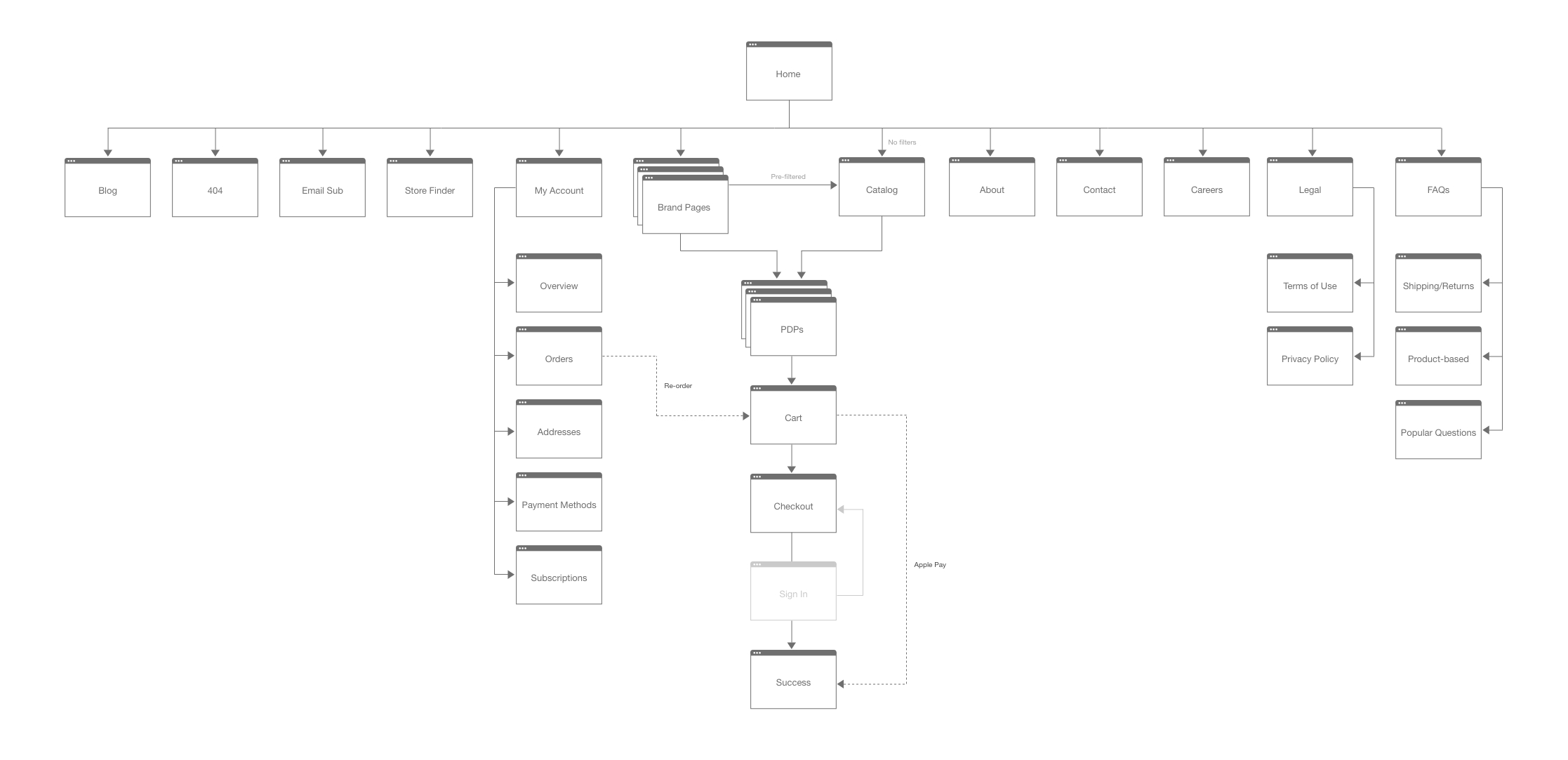
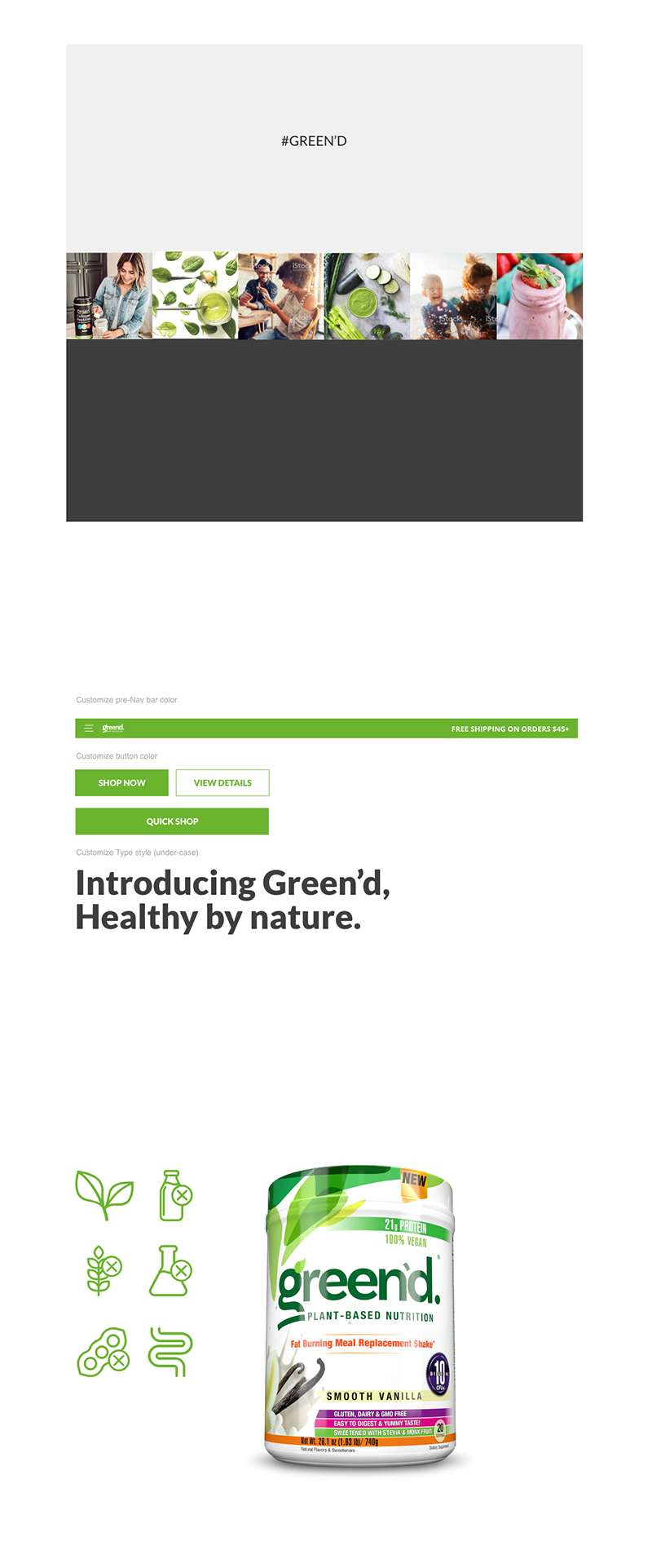
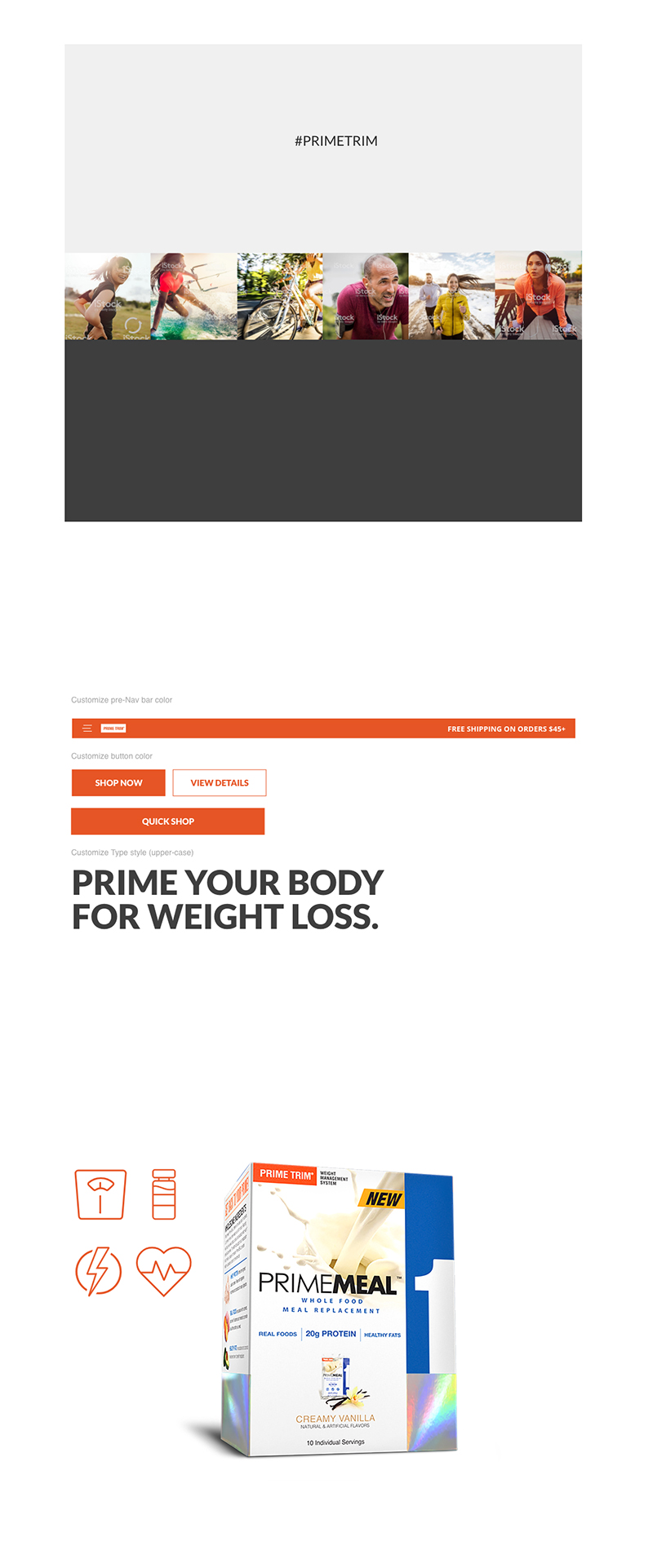
Because Complete Nutrition is a parent brand, I architected the site to include homepages for each of its sub-brands to support their unique visual identity and audience. I chose a handful of UI elements to customize while keeping the rest of the underlying design patterns and styles consistent. I made the root domain a hub to shop by brand and search by goal.

BRAND PAGE 1
BRAND PAGE 2
BRAND PAGE 3
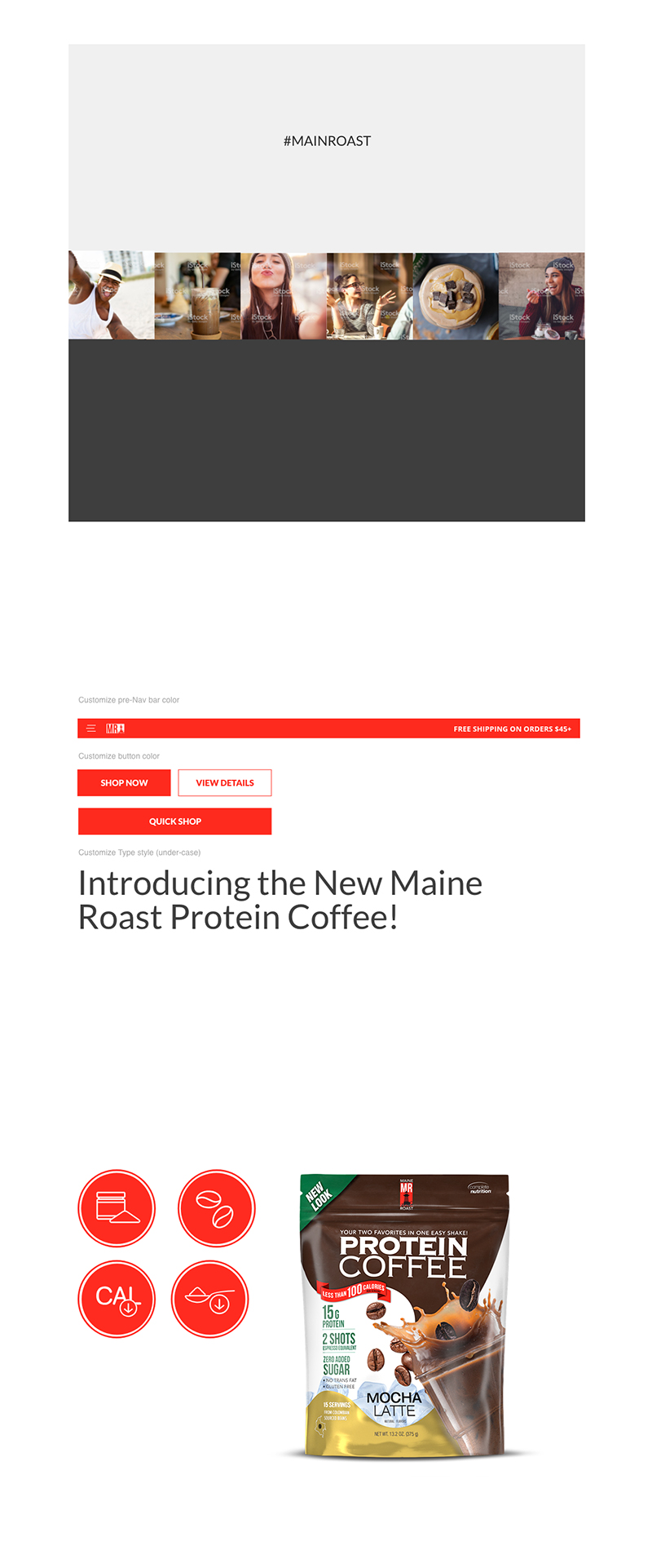
BRAND PAGE 4
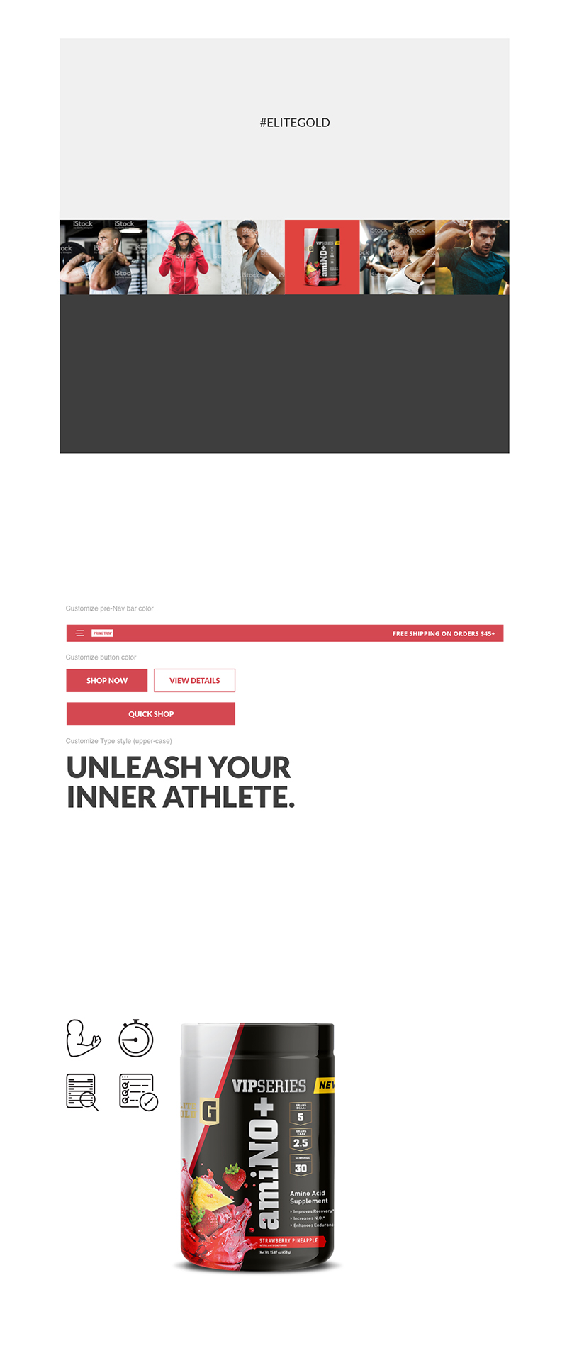
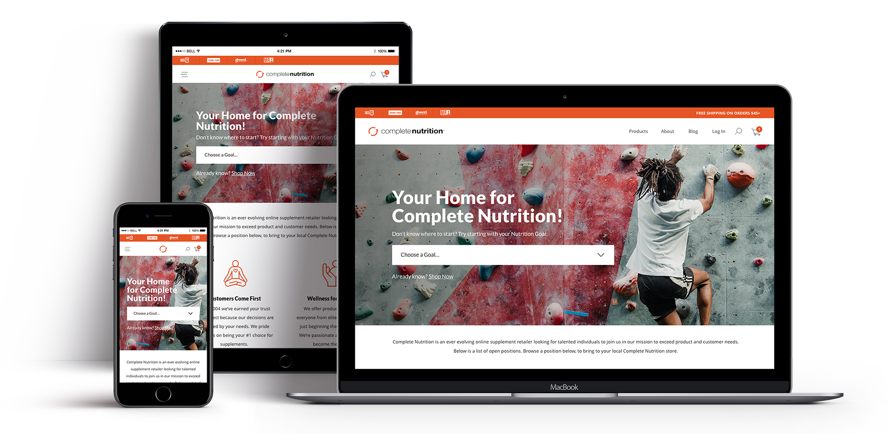
UI DESIGN
Cleaner visual UI design, better usability, and richer feature set.
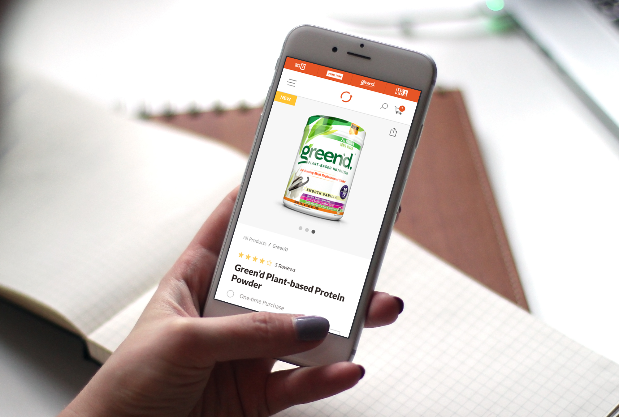
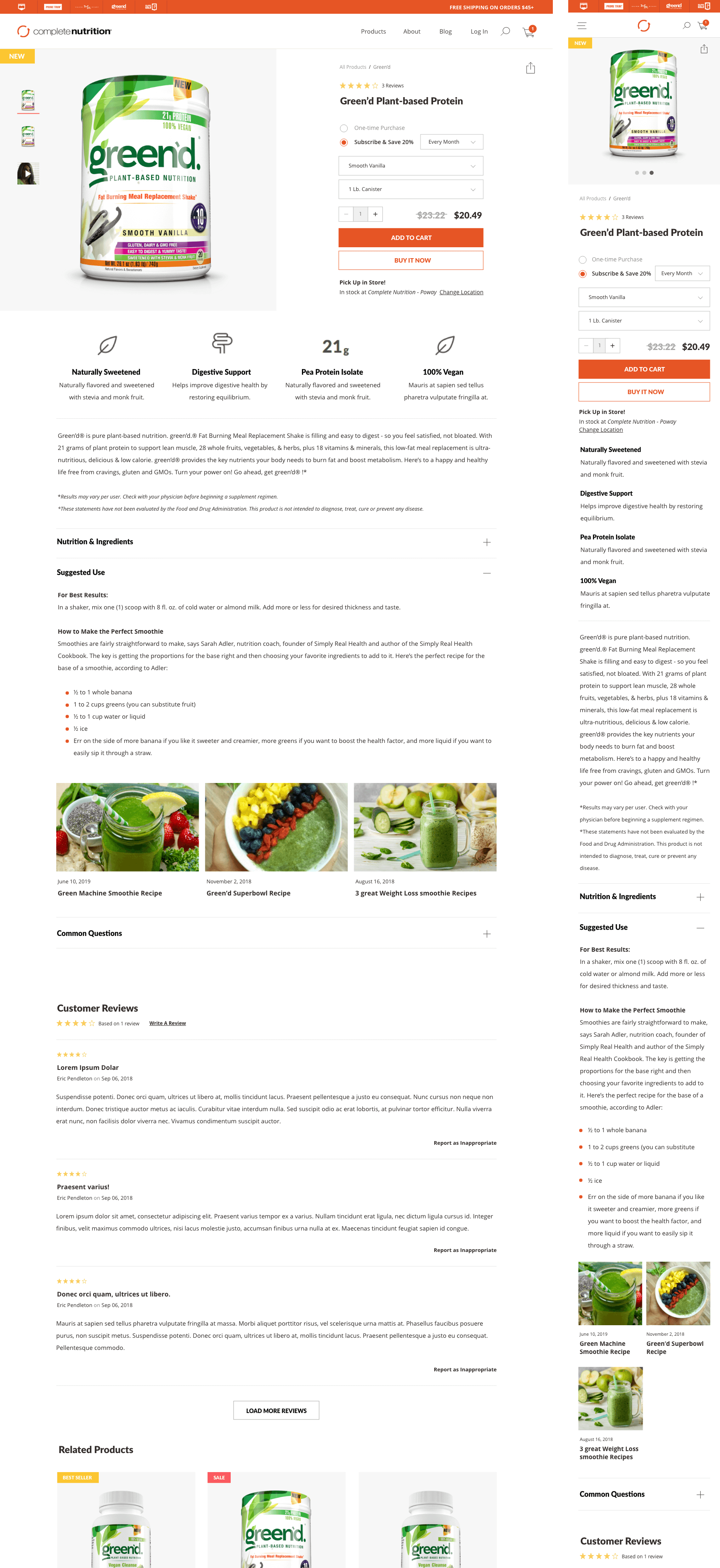
PDP
Optimized PDP design enabling subscriptions and in-store pickup, with clear value callouts and enhanced content sections such as dynamic macro labels and related recipes.
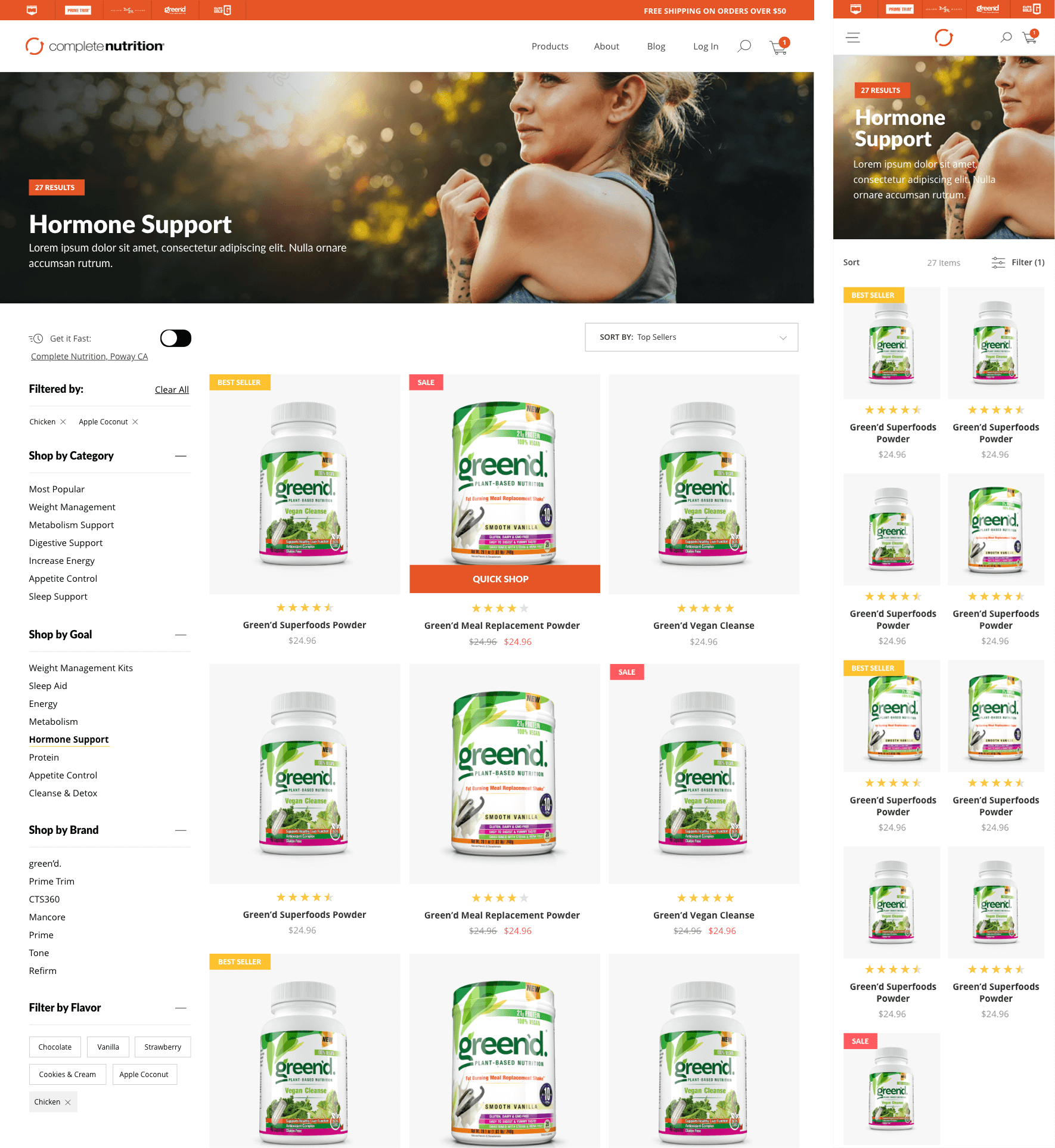
Catalog (PLP)
The new PLP introduced advanced filtering, quick shop, category-level hero banners, and more.
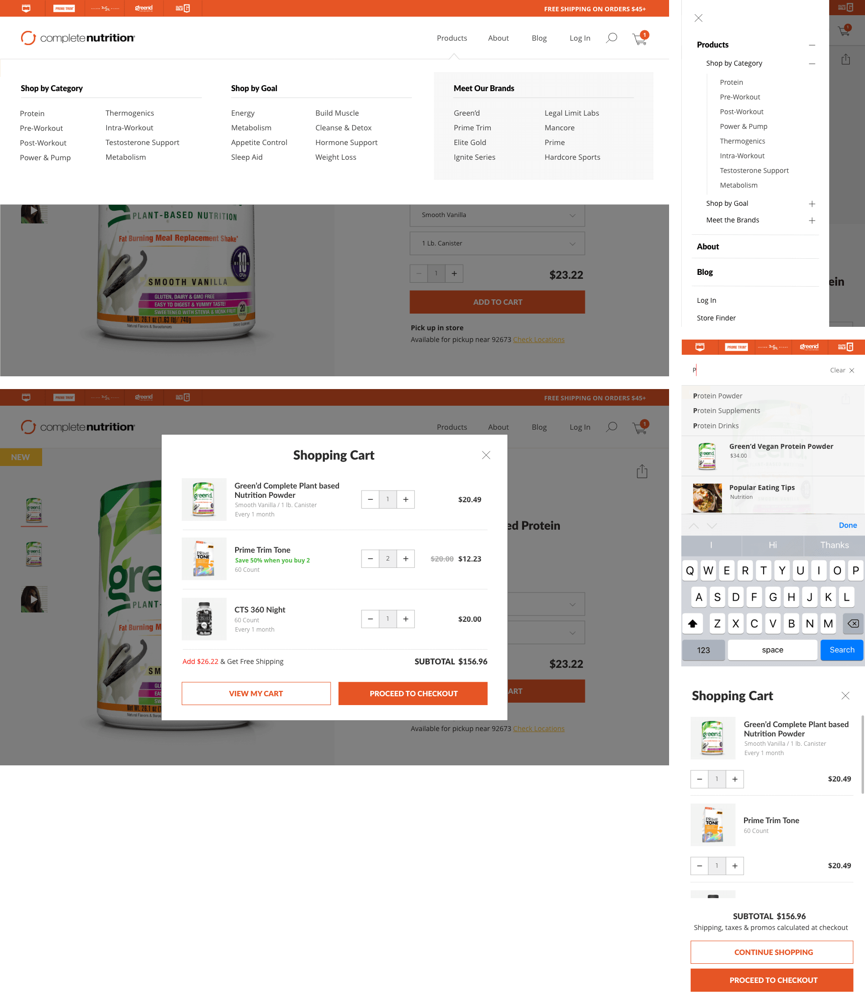
Navigation
The navigation system supports both new and returning users, with a brand toggle, predictive search UI, and more.
Store Finder
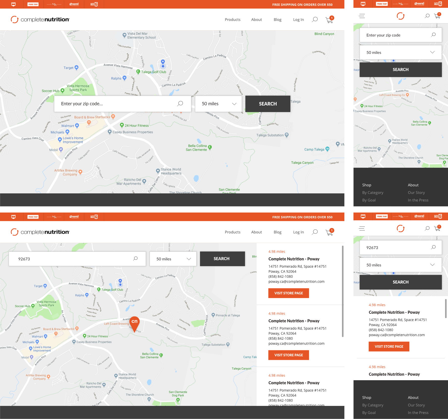
A sleek, modern Store Finder design enhanced with purposeful micro-interactions.
