Brand Spin Off – UX Highlights
SanDisk is a leading global provider of flash memory storage solutions for the capture, storage, management, and transfer of digital content. The Company’s products include memory cards, USB flash drives, and solid‑state drives for consumer, professional, and enterprise applications. When Western Digital spun off the business, it needed a dedicated website and design team. I built it from the ground up — establishing an all‑Figma team, defining the visual direction, and adapting the existing systems to support the new brand quickly and efficiently.
Client: SanDisk Corporation
Year: 2024-2025
Categories: Design Leadership, Strategy, Figma Libraries, Visual Design, UX
TOKENS & CONFIGURABLE COMPONENTS
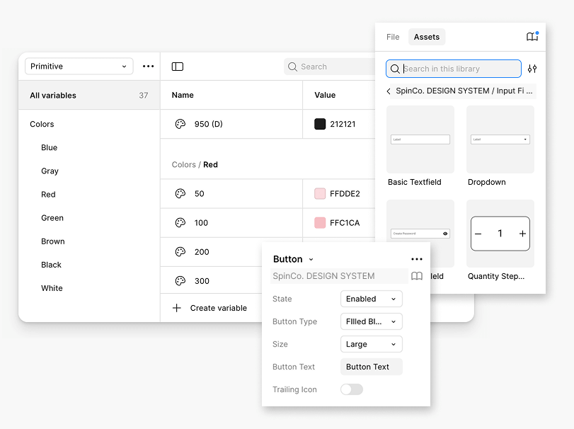
I built a system of JSON‑synced design tokens and reusable, configurable components that align design and development in real time. Core styles like color, spacing, and typography update automatically in production, while flexible components speed up design work and ensure every handoff is accurate, consistent, and fast to implement.
STYLES
This foundation was supported by a comprehensive library of styles, UI components, and design patterns—providing designers and developers with a single source of truth for building consistent, on‑brand experiences at scale.

BRIDGING THE CATALOG SPLIT
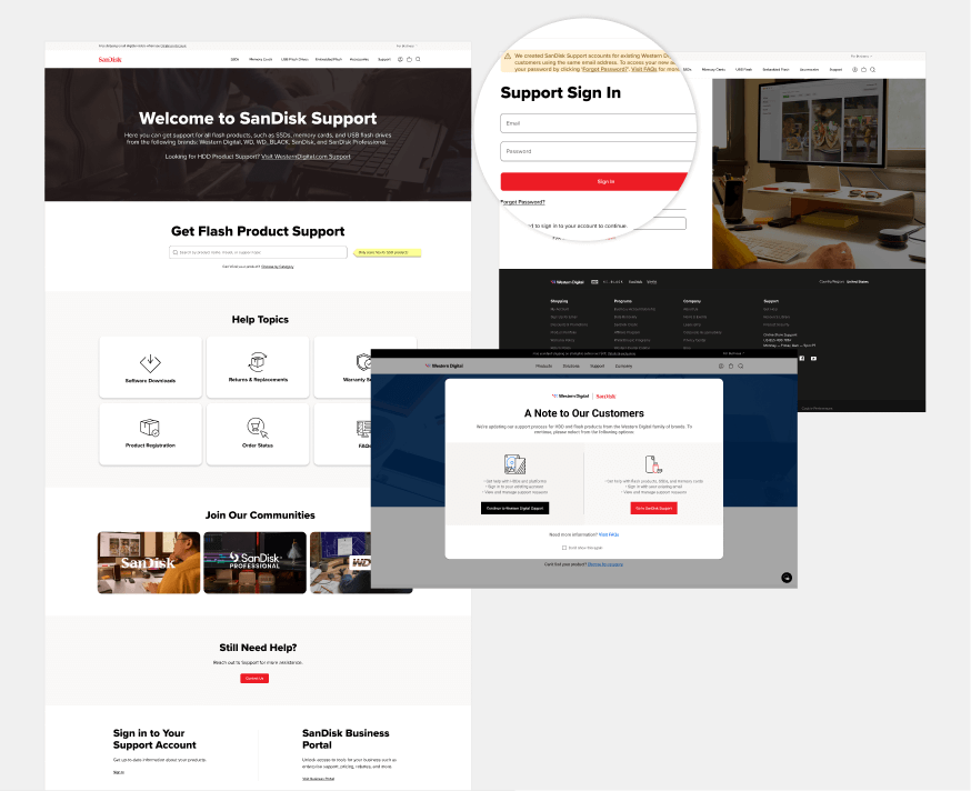
When the product catalog divided between two sites, I led the UX strategy to maintain a seamless customer journey. This included mapping cross‑site paths, unifying navigation patterns, and creating clear wayfinding so users could transition between sites without confusion — preserving continuity across a highly complex product ecosystem.
NAVIGATION
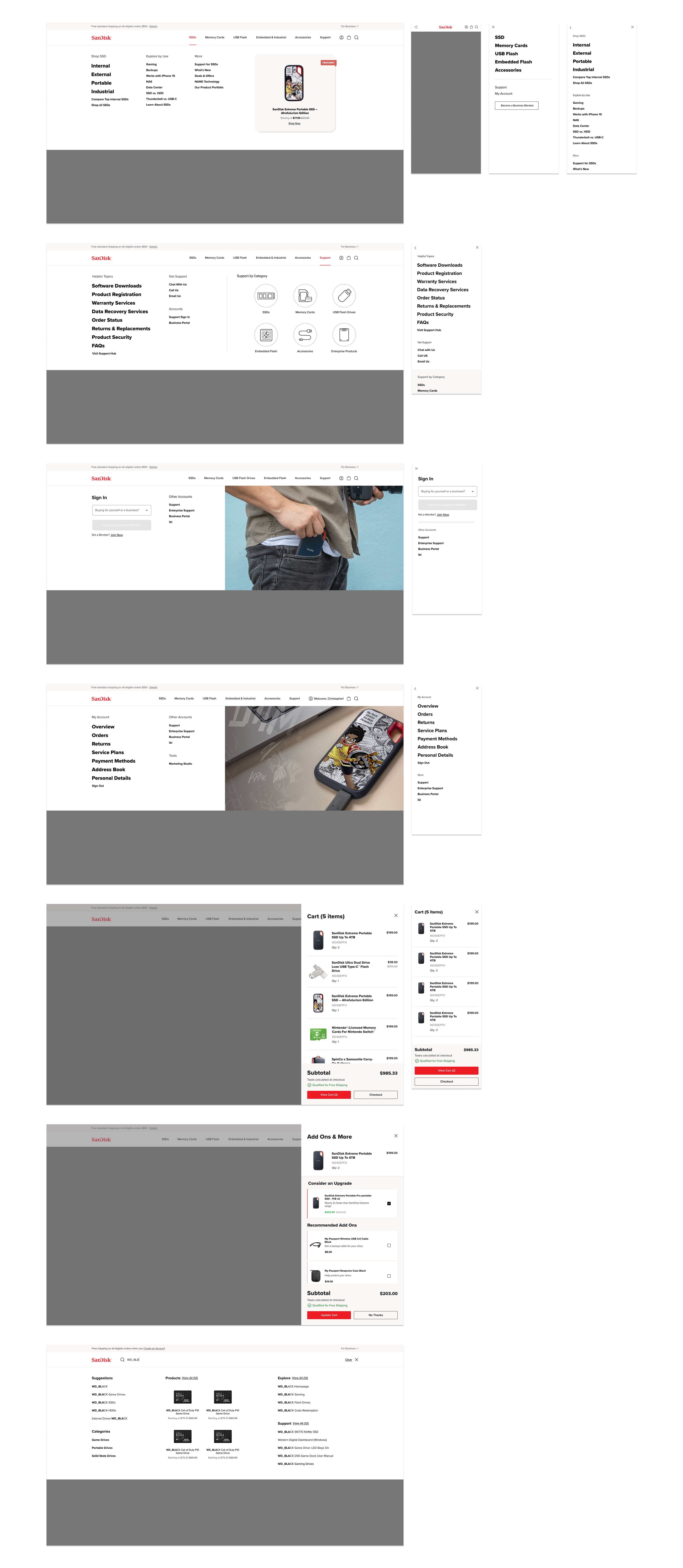
To support every phase of the customer journey within a single category, I created a category‑driven navigation system with integrated product, explore, and support paths, ensuring users can shop, learn, or get help without leaving the category context.
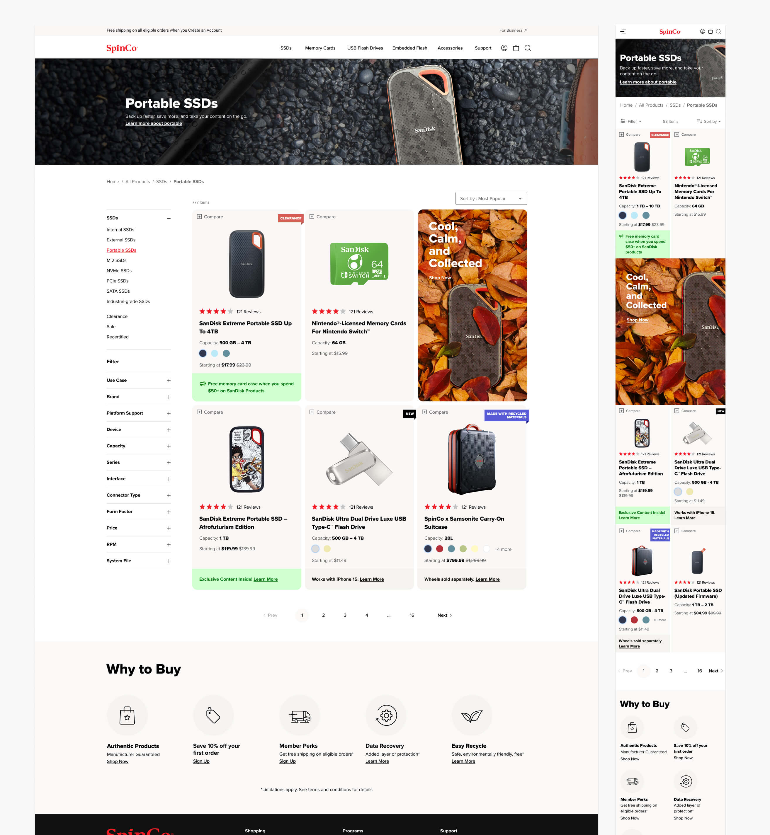
CATALOG
I redesigned the catalog experience with new product cards, full‑width hero banners, an optimized mobile layout, and other enhancements to create a more engaging and shoppable experience.
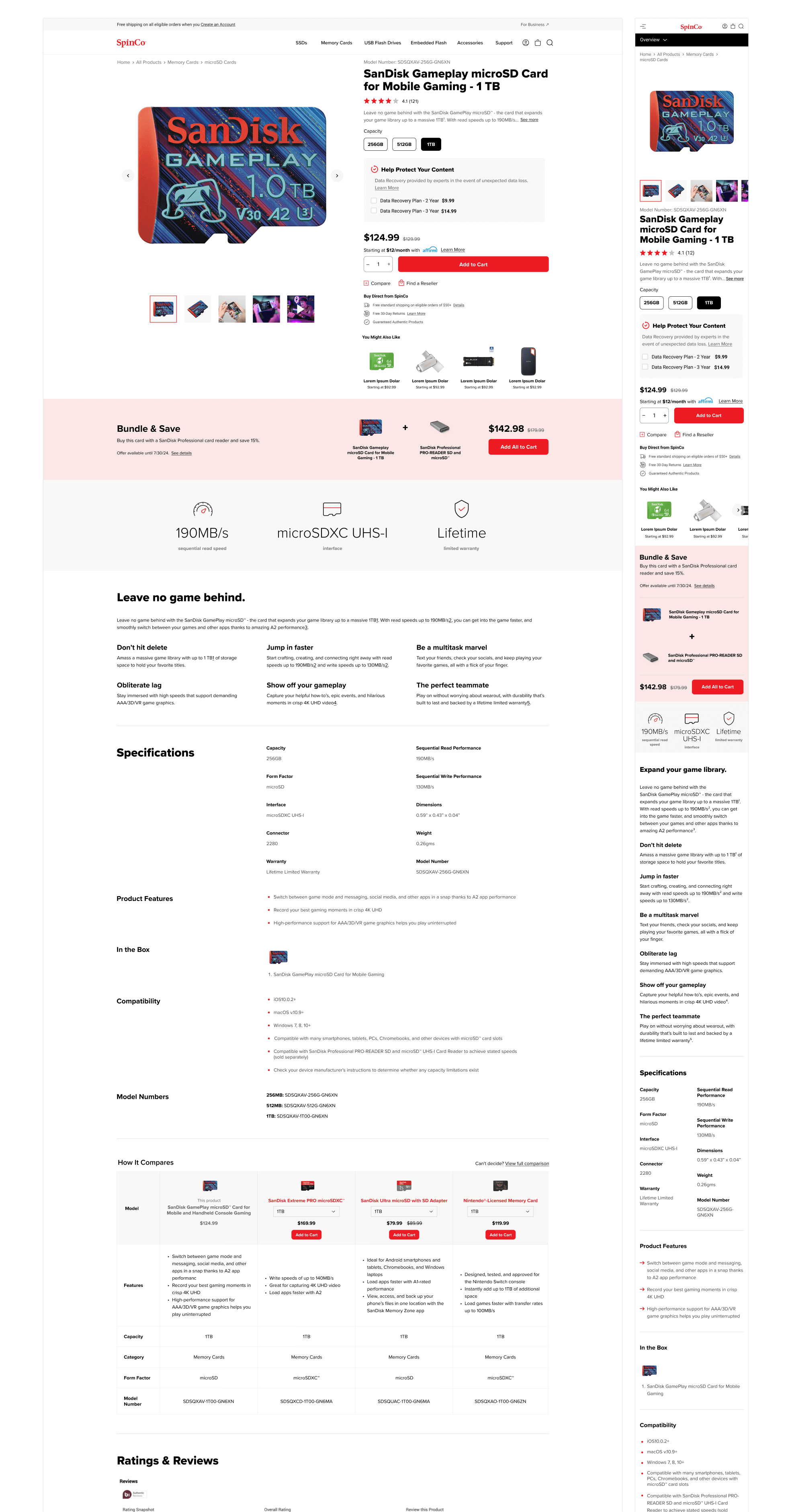
PDP
Alongside a refreshed look and feel, we optimized the PDP to introduce bundles, a compare table, optimized specs, key feature call‑outs, and post‑purchase content—creating a richer, more seamless shopping experience.
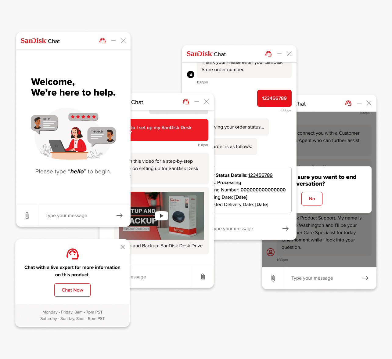
CHAT OPTIMIZATION
Initially driven by the need to reskin the chatbot for the new site, we used the opportunity to introduce enhancements that reduced call volume and improved self‑service. We added the ability to check order status, register products, surface KBA videos from YouTube directly within chat, and connect users directly with a Live Chat Product Specialist at the PDP level—creating a more helpful, brand‑aligned support experience.
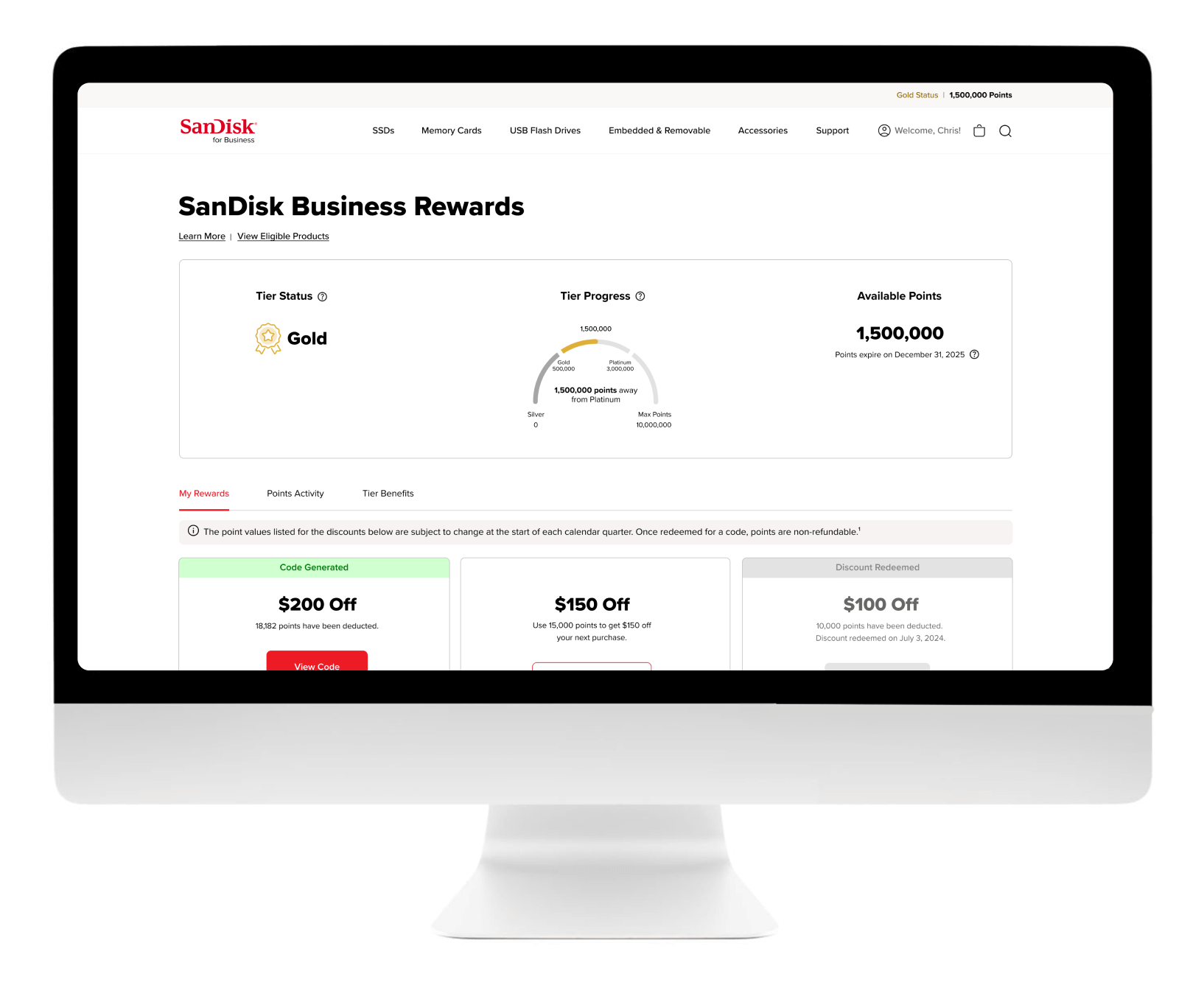
B2B reBRAND
Initially driven by the need to differentiate the SanDisk B2B experience from Western Digital, I used the opportunity to redesign every page for clarity, consistency, and conversion. We refreshed the visual language, streamlined navigation, optimized content hierarchy, and introduced new components tailored to B2B workflows — creating a cohesive, modern experience aligned with the new brand.
LANDING PAGE reDESIGN
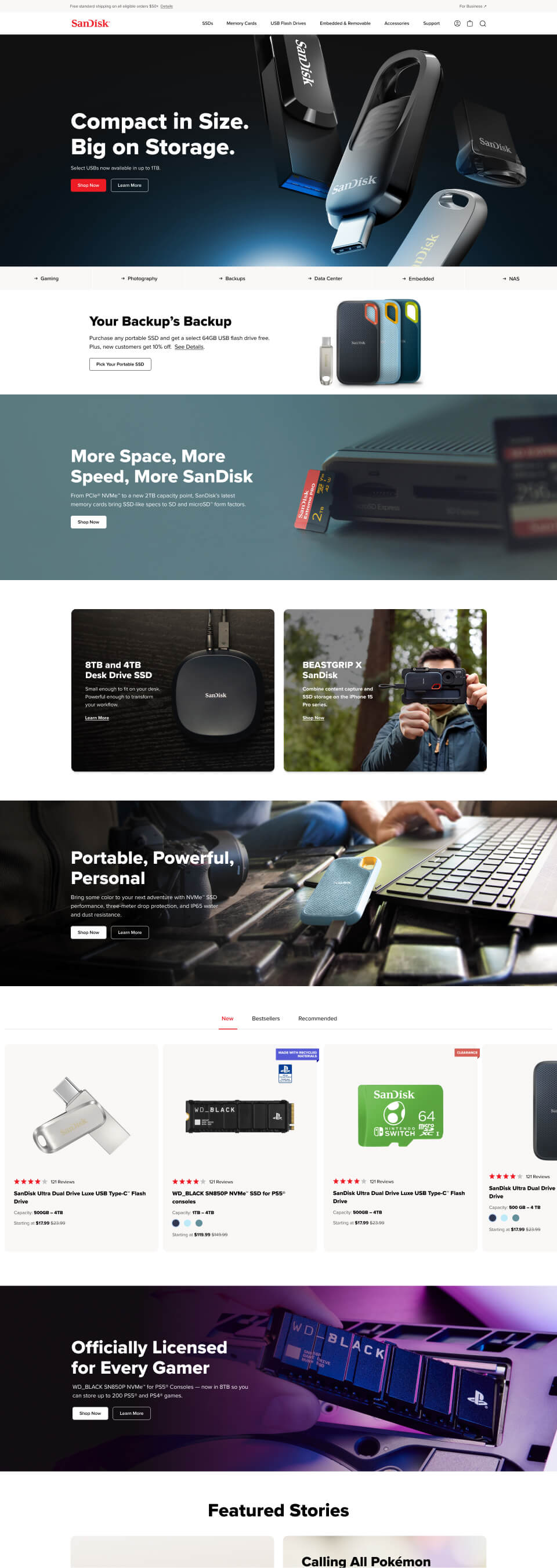
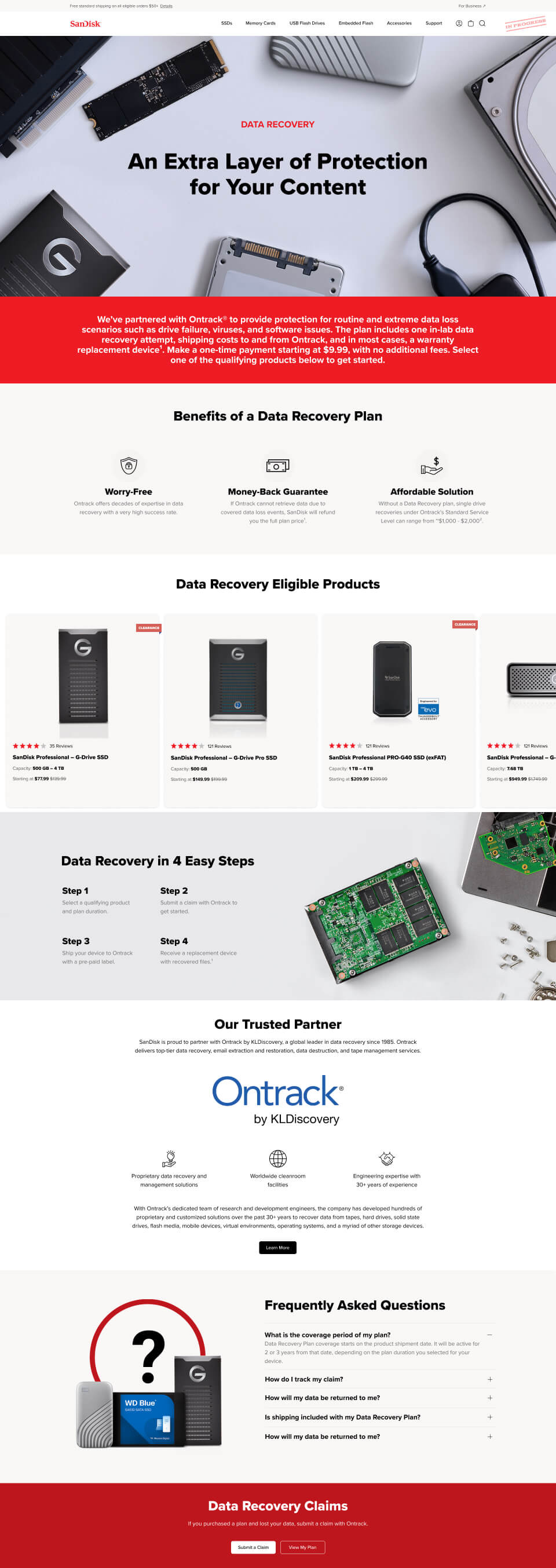
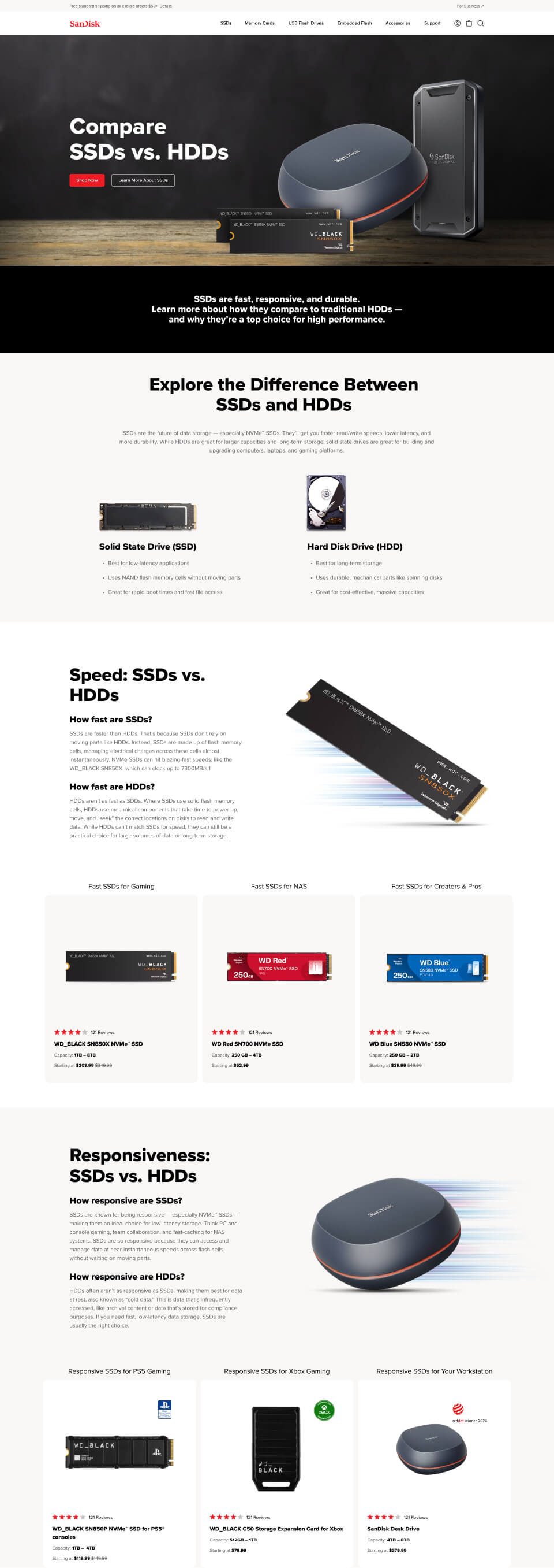
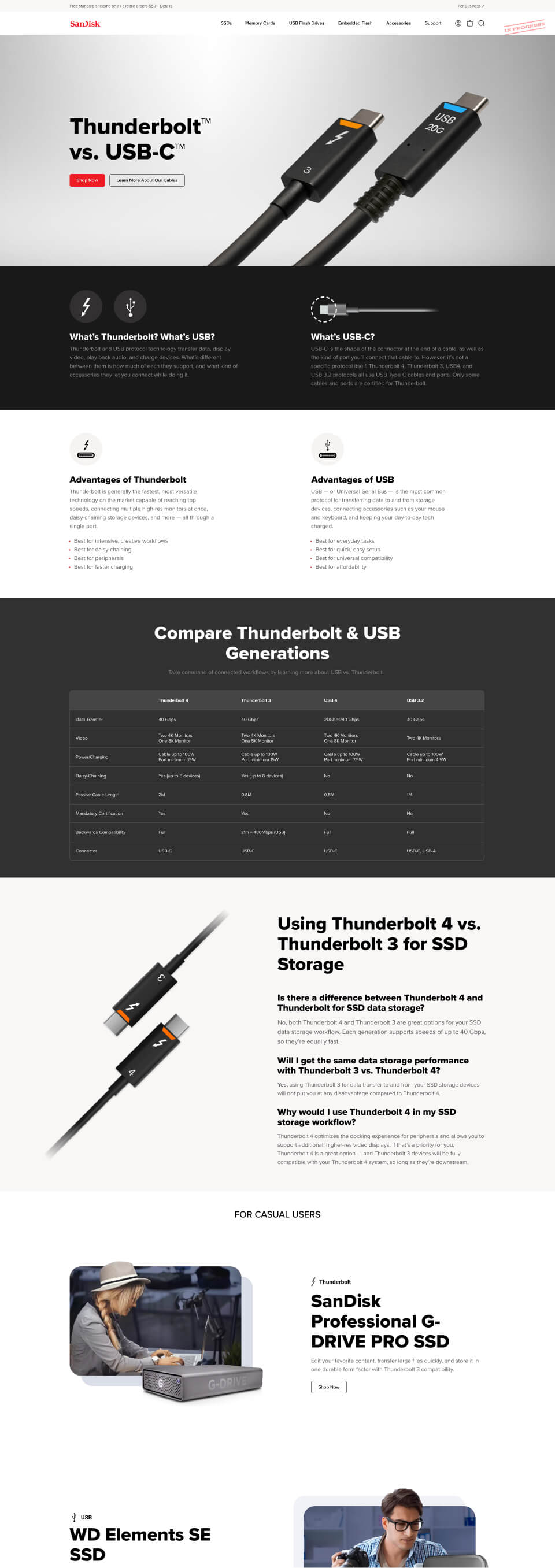
The project required reskinning and designing hundreds of pages; here is a small sample of landing pages showcasing the visual range.
HOMEPAGE
DATA RECOVERY
SSD vs. HDD
THUNDERBOLT™ vs. USB-C™
AND MORE…
Spanning several months and multiple designers, this represents only a small selection of the deliverables. Please contact me to explore the full Figma files or additional design work.


