A Case Study on Iterative Design
Inside Quest, now know as Impact Theory, was not only a content vertical but a manifestation of Quest corporate culture. The show was filmed in front of a live audience and published online. As a pioneering member, I worked on many of its aspects but my primary involvement was with its distribution platform which I designed from the ground up. This case study examines my process designing and optimizing InsideQuest.Com over time with examples of some artifacts along the way.
Client: Quest Studios
Year: 2015 & 2016
Categories: Competitive Analysis, Content Strategy, Style Guide, Usability Testing, Visual Design, Wireframes
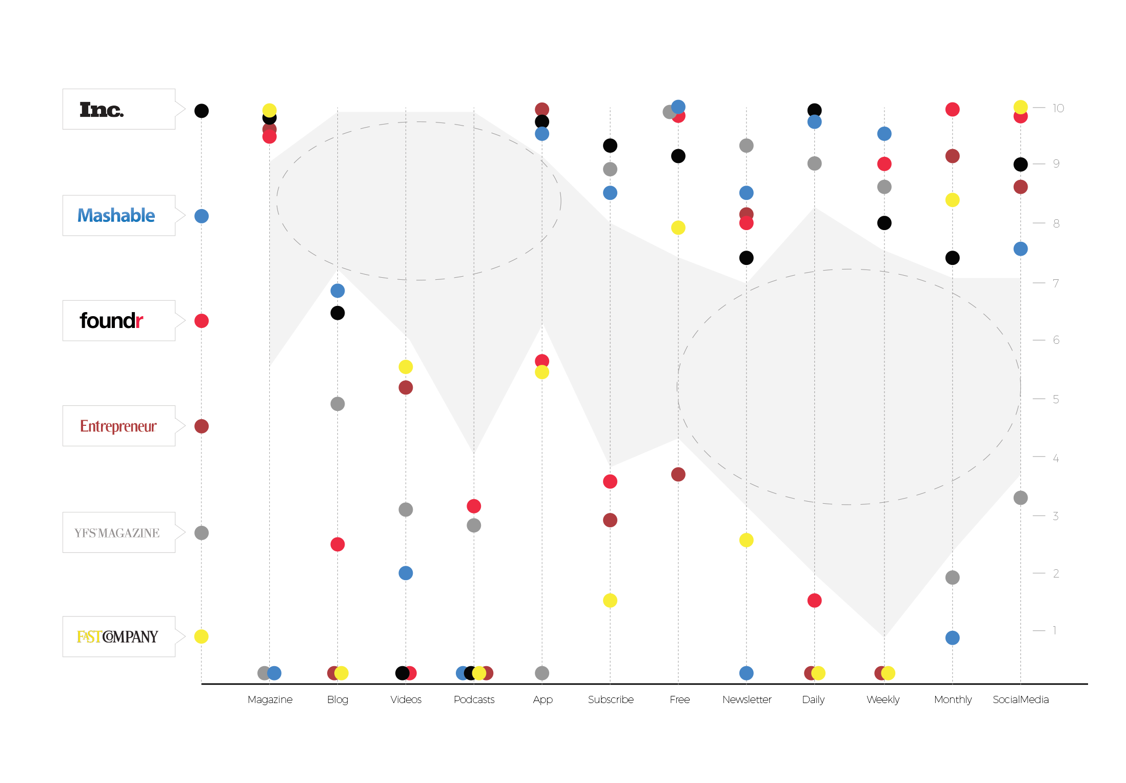
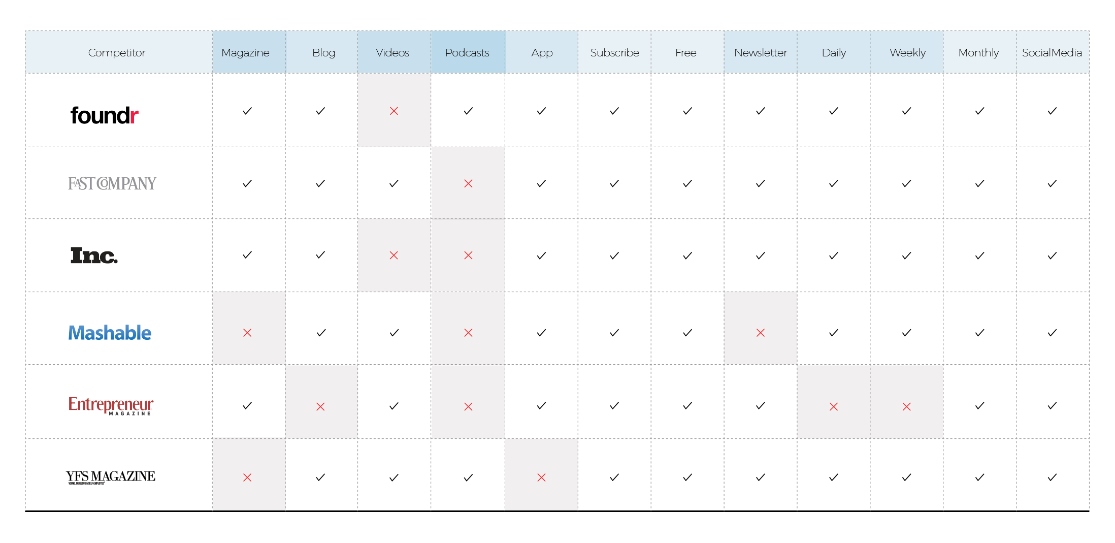
COMPETITIVE ANALYSIS
Here I have accessed the strengths and weaknesses of competing content platforms and exposed areas of opportunity.
BREAKPOINT DESIGN
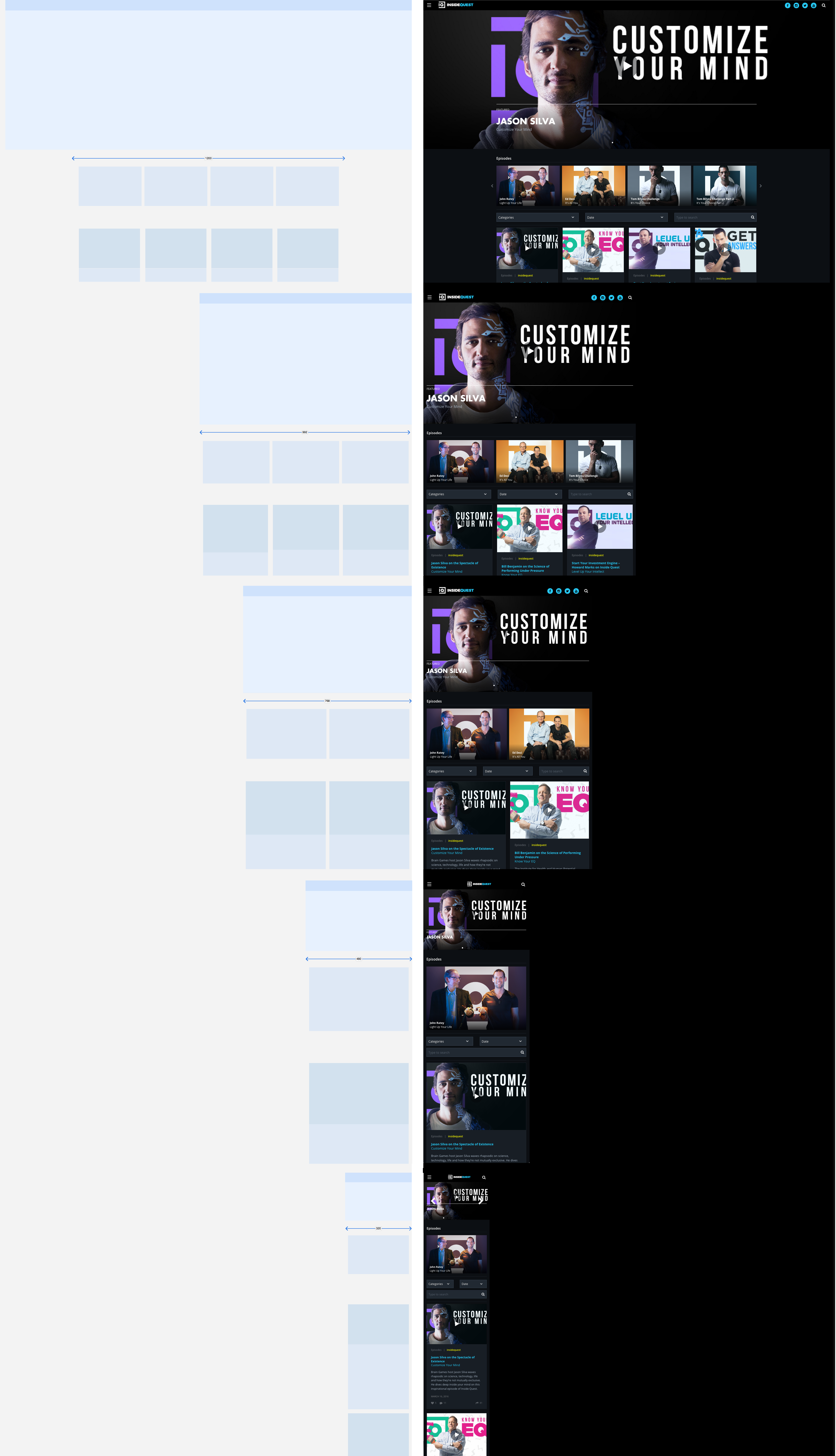
Instead of being concerned with device breakpoints, I design for the smallest viewport first then work my way up view by view making layout changes as needed.
STYLE GUIDE
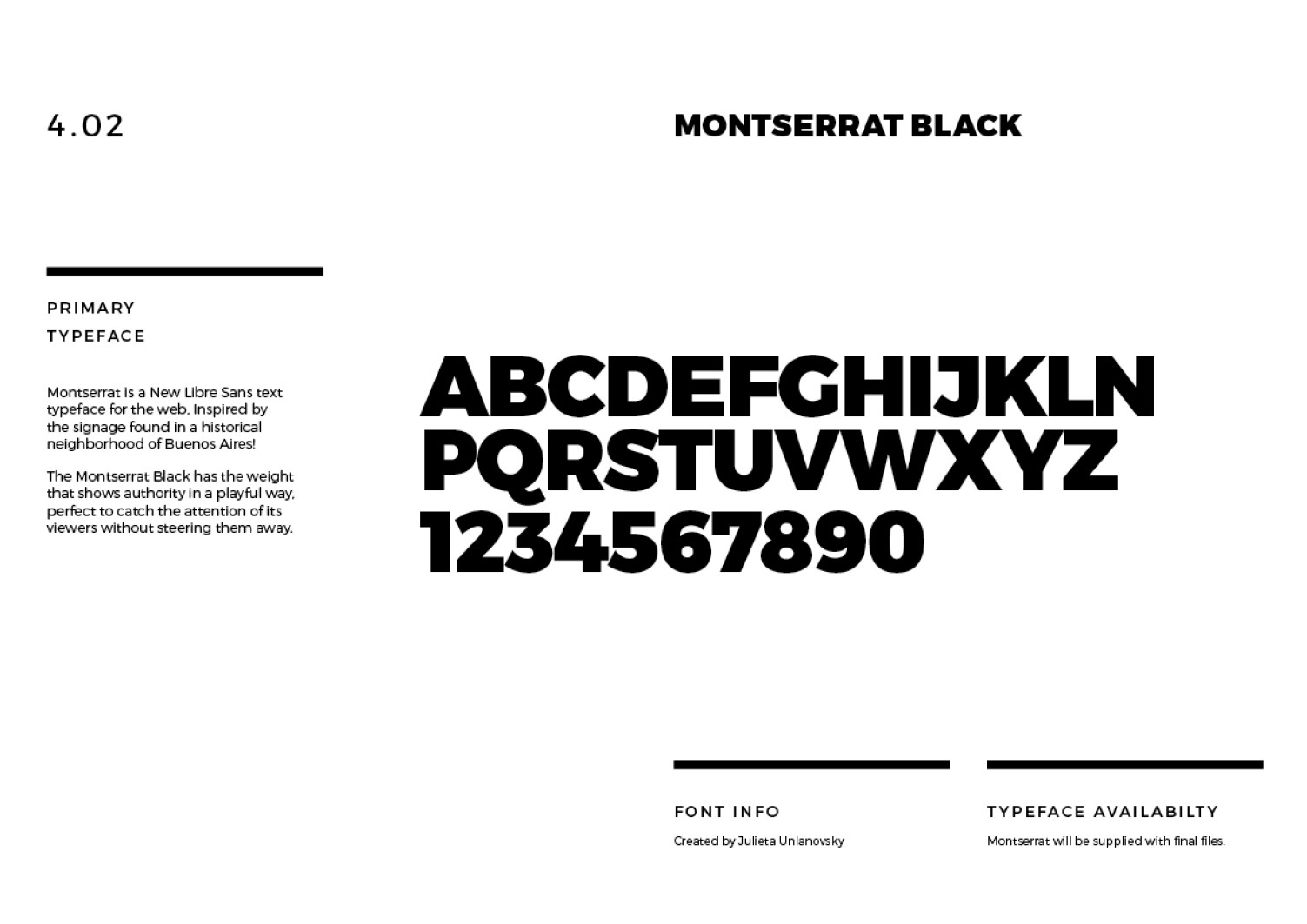
Style guides are an essential tool for ensuring that everyone in our organization is on the same page. below is IQ v1.4.
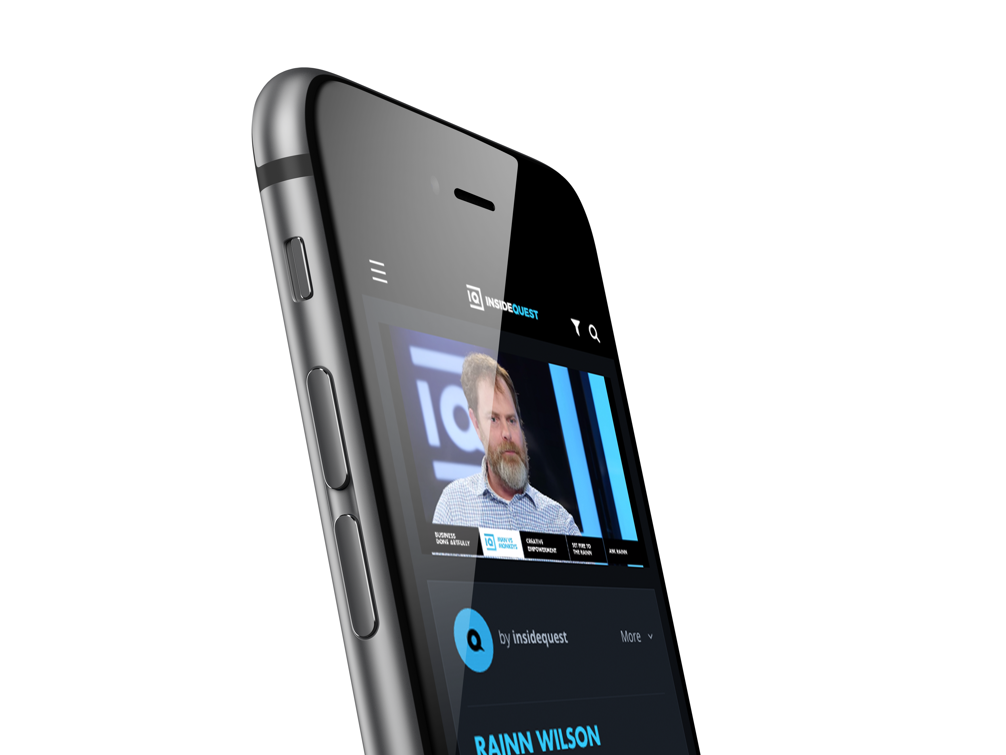
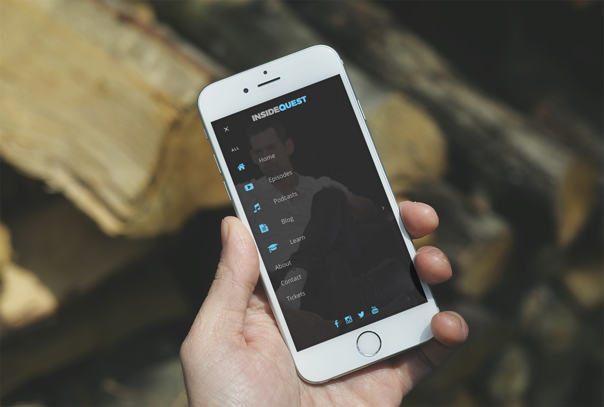
THE USER INTERFACE . MOBILE
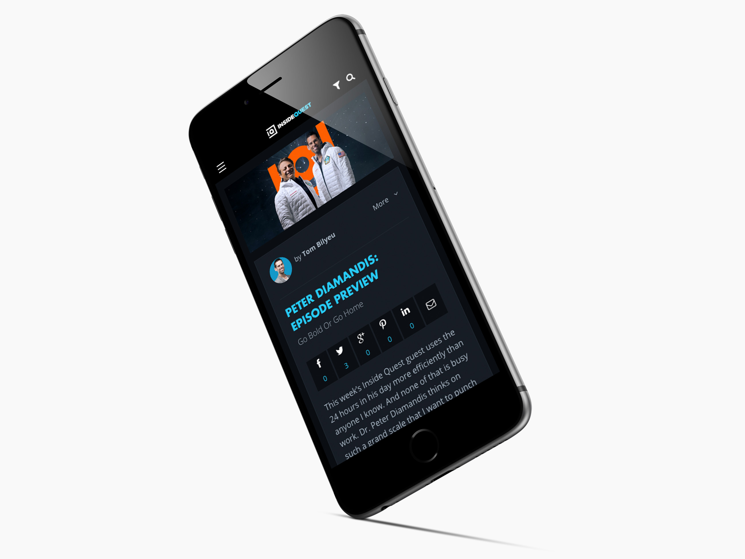
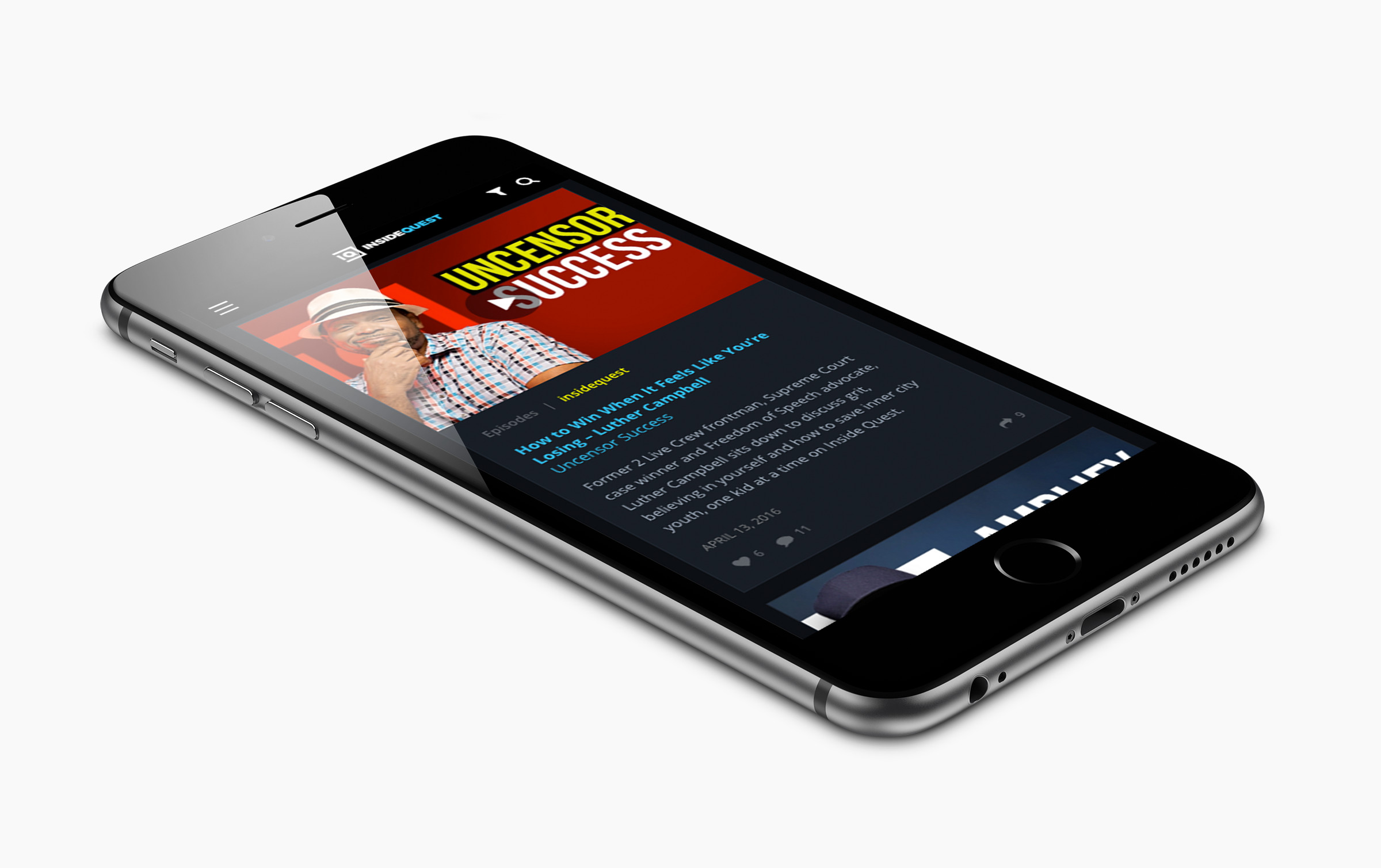
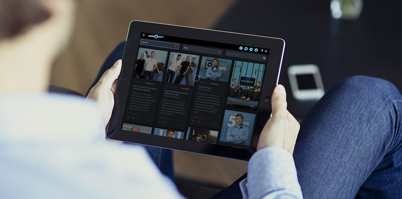
I chose cards as the interaction model for this site. In responsive design, cards easily scale up or down and are highly manipulatable.
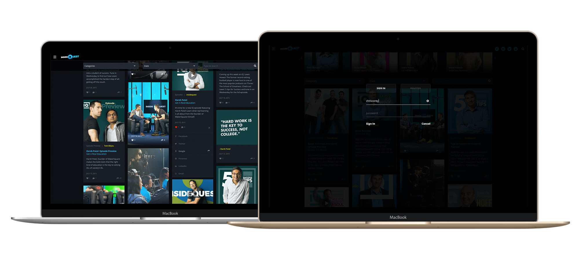
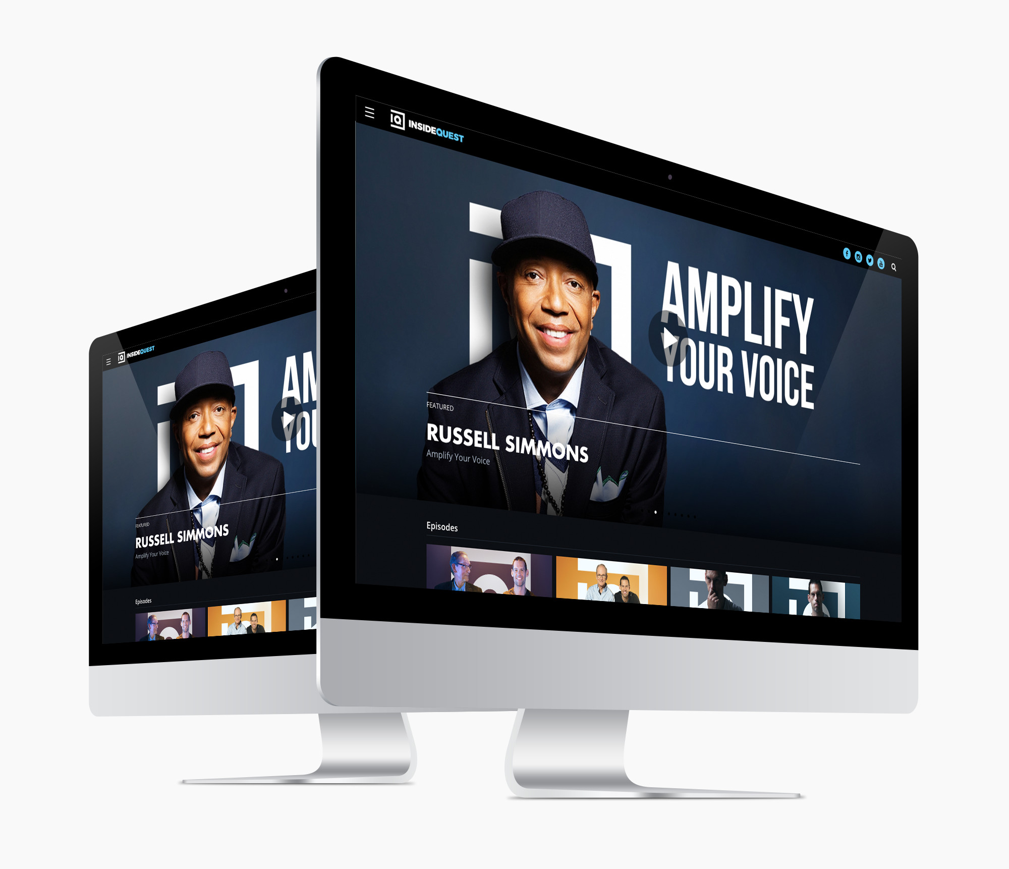
THE USER INTERFACE . DESKTOP
For desktop, Cards were an obvious choice for organizing our short format content and engaging users in addictive browsing.
MODERATED USER TESTING
DESIGN. TEST. EVALUATE. REPEAT.
I conducted user testing to evaluate both content and site usability.
PARTICIPANT DEMOGRAPHICS
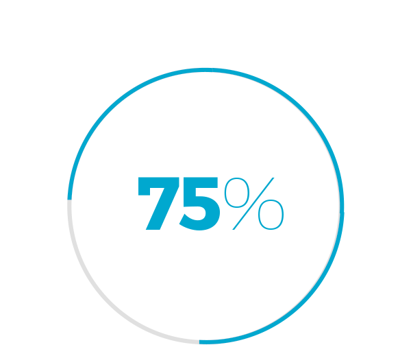
MALE PARTICIPANTS

GRAD STUDENTS
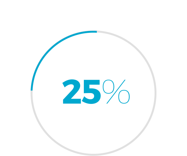
FEMALE PARTICIPANTS

WEB SAVY

UNDERGRAD STUDENTS

WEB DUMB

METHOD & RESULTS
From the results, the most significant items are as follows
STRENGTHS
INSPIRATIONAL QUOTES
EASY NAVIGATION
HD PHOTOS
QUALITY GUESTS
AREAS OF OPPORTUNITY
VIDEOS TOO LONG
WEBSITE PURPOSE UNCLEAR
TOO DARK
REDUNDANT IMAGES
THE RE-DESIGN
Design is about making things good and then better.
Based on the user feedback, I revisited the site’s visual and information design as well as content strategy.
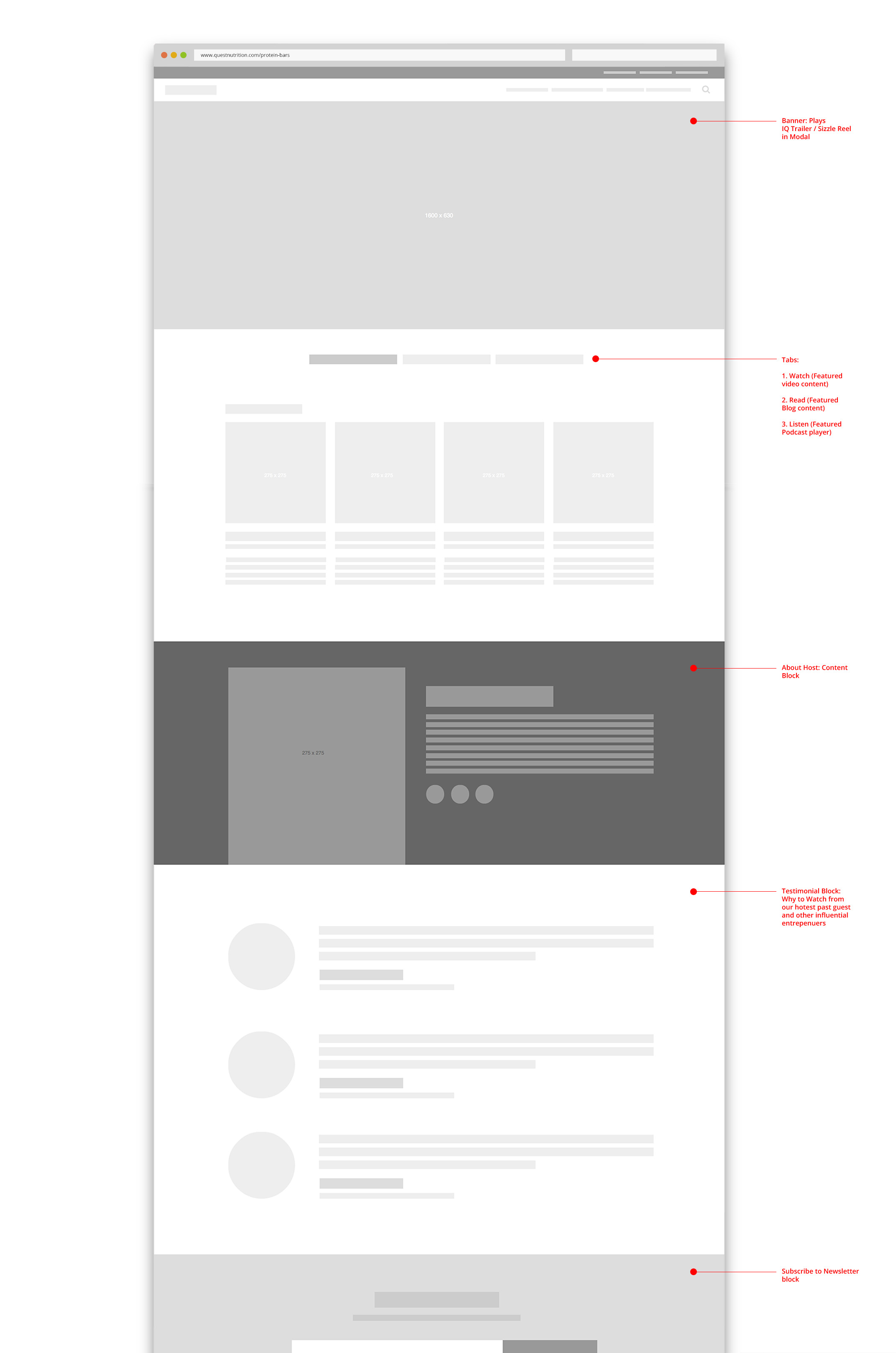
THE HOMEPAGE
Upon finding our home from a content perspective, I designed a home-page that communicated its value.
THE READING LIST
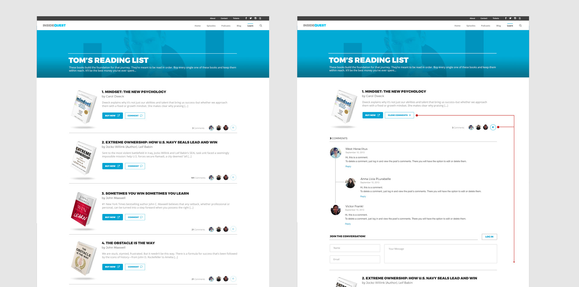
I took the Reading List a step further by adding threaded comments and CTA’s for books in printed and audio formats.
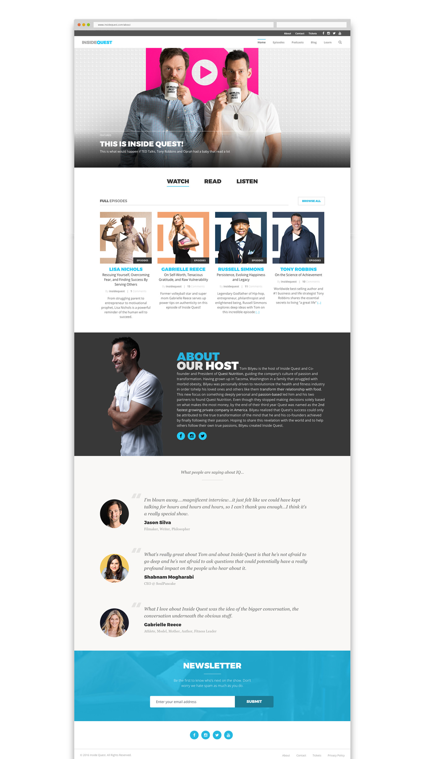
ABOUT
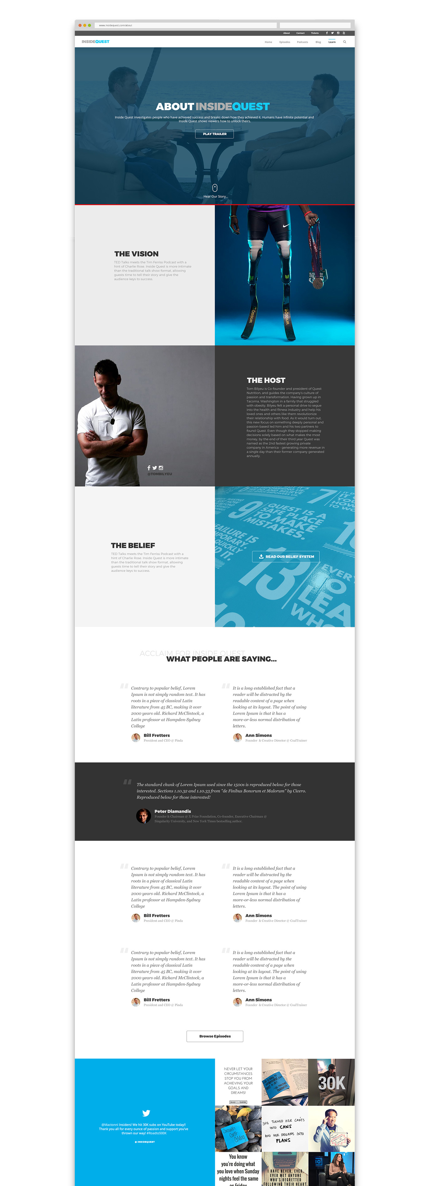
The new About page is much more comprehensive. What used to be three separate pages, I combined into one and added testimonials and social media feeds.
SINGLE EPISODE PAGE
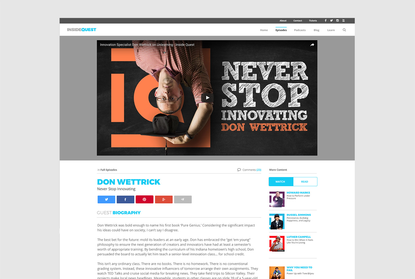
For this page, I decided to merge all guest content into a single post and add section navigation. This simplified the browsing experience for end-users and reduced our internal-facing launch requirements.
. . . ON MOBILE
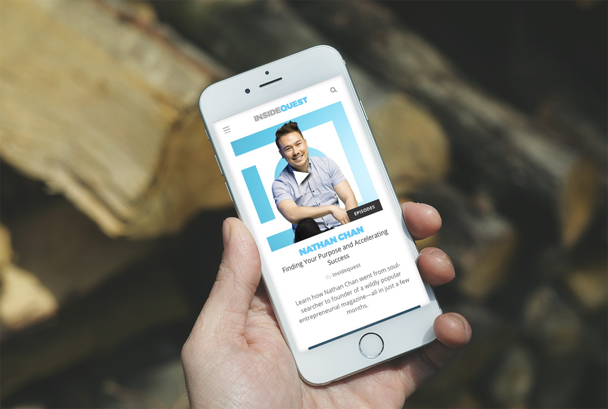
A great experience cross-device is my ongoing intent. I am always optimizing, testing, and optimizing more. This iteration saw a number of updates on mobile and tablet.


AND THE SWAG
Applying the new color ways on all our merchandise.
.User { Position: Center; }


